

Friendship Coffee Company
Responsive Redesign
Redesigned the Friendship Coffee Company website into a responsive, mobile-first experience that helps users quickly find key information—such as menus, hours, and location—while highlighting the café’s atmosphere and community-focused brand.
Overview
Friendship Coffee Company Website Redesign
Local café websites are often the first place customers go to learn about a business, yet many small business sites make it difficult for users to quickly find essential information like menus, hours, and location—especially on mobile devices. This project explored how redesigning the Friendship Coffee Company website into a responsive, mobile-first experience could help customers easily access key information while also showcasing the café’s atmosphere, offerings, and community-focused brand.
Duration
Role
4 weeks
Sole Designer & Researcher
Skills
Research UX/UI Prototyping Testing
Discovery
The Problem
Customers often visit café websites with the goal of quickly finding essential information such as the menu, hours, and location. However, many small business websites make this information difficult to locate, especially on mobile devices, requiring users to scroll through multiple sections or search through poorly structured pages.
Friendship Coffee Company’s existing website lacked clear information hierarchy and mobile optimization, making it harder for users to quickly access the details they need to decide whether to visit the café. This creates friction in the decision-making process and can discourage potential customers from engaging further with the business.
The Goal
Design a responsive, mobile-first website for Friendship Coffee Company that allows users to quickly find essential information—such as the menu, hours, and location—while clearly showcasing the café’s atmosphere, offerings, and community-focused brand.
User Interviews
To better understand how people search for and evaluate café websites, I conducted user interviews focused on how often users visit coffee shops, what information they look for before visiting, and the frustrations they experience when navigating small business websites. These interviews helped identify the most important information users expect to find—such as menus, hours, location, and photos of food or the space—along with common usability issues that make café websites difficult to use, especially on mobile devices.
Interviewees
Demographics
5
Ages 24-68
Method
Moderated
Key Insights
Users primarily visit café websites to quickly access essential information such as the menu, hours, and location. If these details are difficult to find, users often leave the site and rely on alternatives like Google Maps or reviews.
Visual content plays a major role in decision-making. Photos of food, drinks, and the café environment help users understand the atmosphere and offerings before deciding to visit.
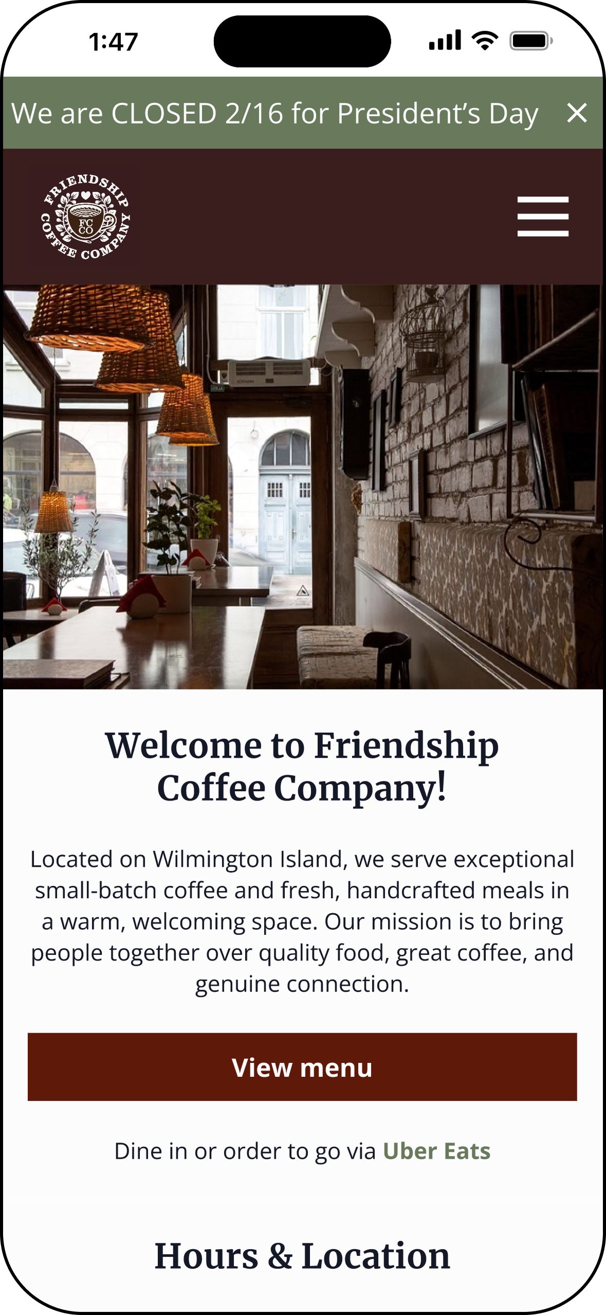
Mobile usability is critical. Most participants reported searching for cafés on their phones, meaning navigation, readability, and tap targets must be optimized for small screens.
Clear and familiar menu organization improves usability. Users expect menu items to be grouped into recognizable categories such as breakfast, sandwiches, and drinks so they can quickly scan for what they want.
Users want to understand the overall café experience, not just the menu. Information about the café’s story, atmosphere, and community helps build trust and encourages people to visit.
Cluttered layouts, small text, and unresponsive buttons create frustration. These issues can make it harder for users to complete simple tasks like viewing the menu or finding hours and location.
Competitive Analysis
Local café websites such as Foxy Loxy Café, The Ibis Bar, and Hidden Grounds Coffee were reviewed to understand how similar businesses present information and support customer decision-making online. While these websites showcase strong branding and appealing visuals, many also contain usability issues that make it harder for users to quickly locate important information. Analyzing these sites helped identify both strengths and opportunities for improvement that informed the redesign of the Friendship Coffee Company website.
Problems with Existing Solutions
Important details such as hours, location, or menu access are sometimes placed far down the page or within secondary pages, forcing users to scroll or search before finding the information they need.
Hidden Key Information
Some café websites rely on layouts or navigation patterns that are not fully optimized for mobile devices, resulting in smaller tap targets, crowded layouts, or navigation that requires extra effort to use on a phone.
Mobile Navigation Limits
Heuristics Evaluation of the Existing Website
To further understand the usability challenges of the existing Friendship Coffee Company website, I conducted a heuristic evaluation using Nielsen’s 10 Usability Heuristics. This evaluation helped identify areas where the current website did not fully support users’ goals, particularly when trying to quickly access important information such as menus, hours, and location. By analyzing the site through established usability principles, I was able to pinpoint opportunities to improve navigation, information hierarchy, and mobile usability that informed the redesign.
Heuristics Evaluation Findings
Key information such as hours and location are not immediately visible on the homepage, requiring users to navigate to a different screen before confirming whether the café is open or where it is located.
Visibility of System Status
Users must navigate through multiple sections or scroll through large content blocks to locate the menu, rather than being presented with a clear and immediate path to this information.
Recognition Rather than Recall
Large content sections and cluttered layout create excessive scrolling, particularly on mobile devices, making it harder for users to quickly find essential information.
Aesthetic and Minimalist Design
Navigation and page structure do not always follow predictable patterns, which can make it less clear where users should go to find information such as menu items or café details.
Consistency and Standards
Important tasks—such as viewing the menu or confirming hours—require extra steps instead of being immediately accessible from the main interface.
Flexibility and Efficiency of Use
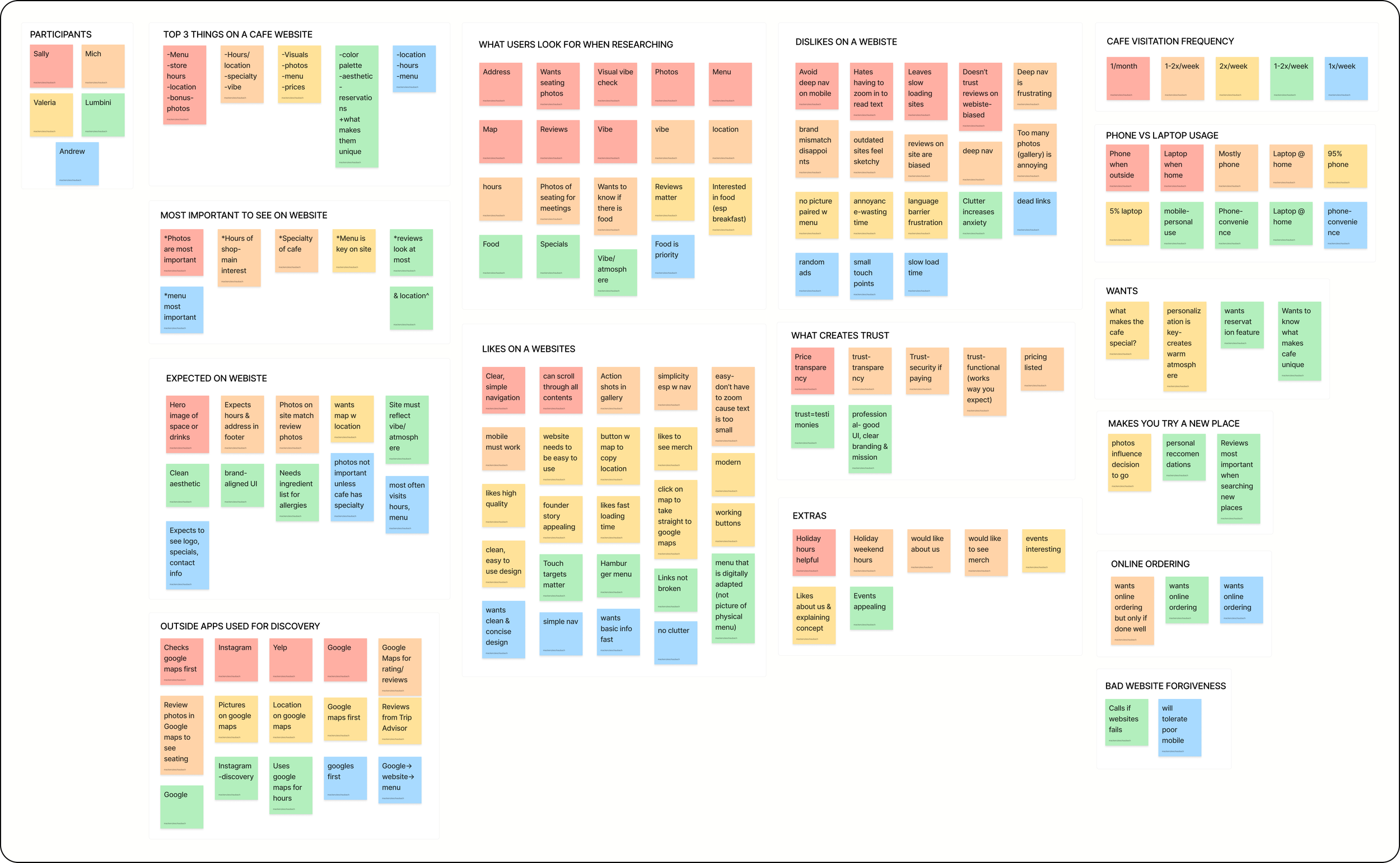
Affinity Mapping
To synthesize research findings, I created an affinity map to organize patterns and themes that emerged from user interviews. Grouping feedback into categories helped identify key insights, common frustrations, and user goals when visiting café websites—such as quickly finding menus, hours, and location information. These insights ultimately informed the design priorities and feature decisions for the Friendship Coffee Company website redesign.
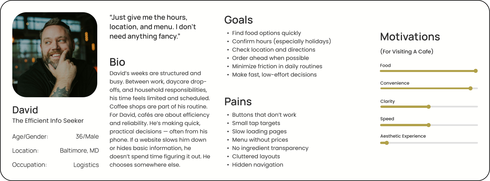
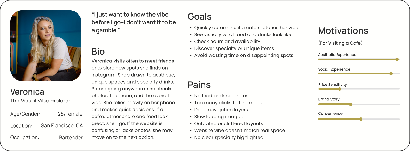
Understanding the User
Based on research insights, two personas were developed: David, The Efficient Information Seeker, and Rachel, The Visual Vibe Explorer. While David represents users who frequently search for cafés and want to quickly find essential information like menus, hours, and location, Rachel represents socially driven users who look for welcoming spaces to meet friends or coworkers and want to understand the café’s atmosphere, offerings, and overall experience before visiting.
User Needs and Wants
Quick Access
Users need to quickly find essential information when visiting a café website.
Clear Menus
Users want easy-to-find menus categorically organized with photos.
Location Visibility
Users need to easily see where the café is located and whether it is currently open.
Atmosphere Preview
Users want to see photos and descriptions that help them understand the café’s vibe.
Ideation
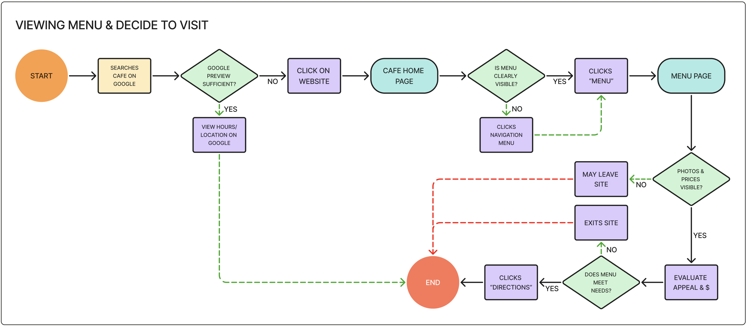
User Flow
This user flow illustrates how users view the café menu and decide whether to visit Friendship Coffee Company. From the homepage, users select “View Menu,” browse menu categories such as coffee, breakfast, or sandwiches, and review food descriptions and prices. After exploring the offerings, users can then confirm the café’s hours and location before deciding to visit.
Mid-Fidelity Screens
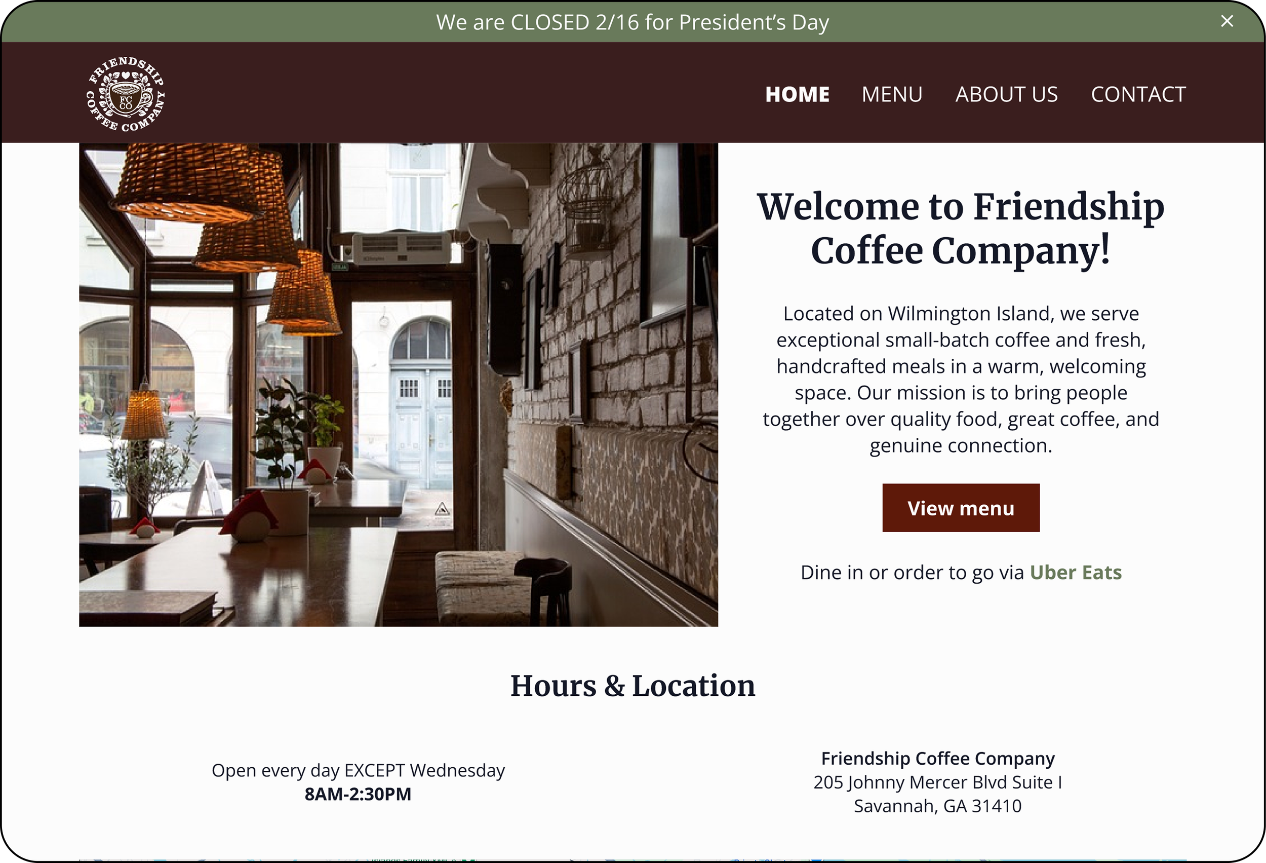
After ideating through low-fidelity sketches, mid-fidelity screens were created to refine the layout, navigation, and information hierarchy of the website before moving on to visual design. At this stage, I focused on ensuring that key pages—such as the homepage, menu, and about page—made essential information easy to find. These screens allowed me to test the overall structure and user flows while identifying opportunities to improve clarity, spacing, and mobile usability.
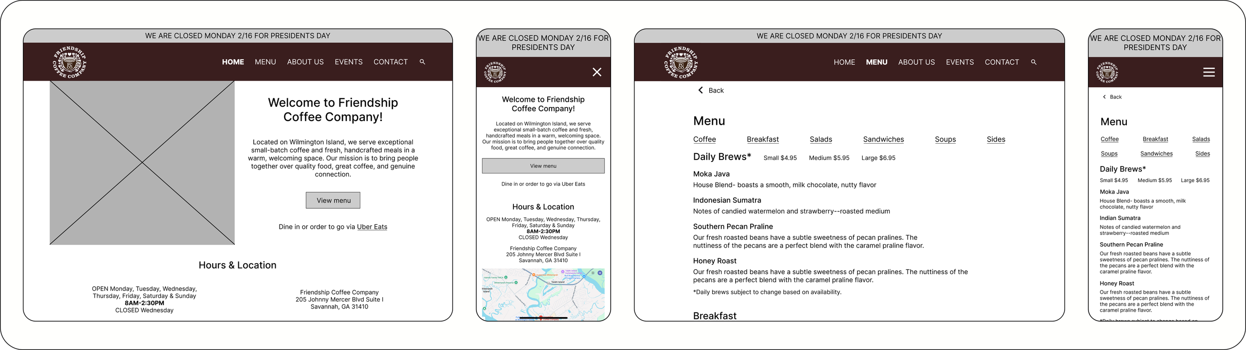
Frame 1: Home page, Desktop | Frame 2: Home page, Mobile | Frame 3: Menu, Desktop | Frame 4: Menu, Mobile
Design
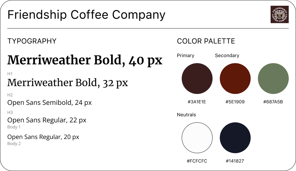
Branding
Working within Friendship Coffee Company’s existing brand identity ensured that the redesigned website remained recognizable while improving the overall user experience. A key focus was maintaining the café’s established color palette, warm tone, and community-centered personality while introducing a clearer layout and modern interface. By carefully applying consistent typography, imagery, and visual hierarchy throughout the design, the new website enhances usability while preserving the welcoming, local character that customers associate with Friendship Coffee Company.
High Fidelity Screens
Applying Friendship Coffee Company’s branding and established design elements, I developed high-fidelity screens to translate the mid-fidelity layouts into a realistic website experience. This phase focused on refining visual hierarchy, typography, imagery, and spacing while ensuring that key information remained easy to find. The high-fidelity designs also emphasized a warm, welcoming aesthetic that reflects the café’s community-focused atmosphere.
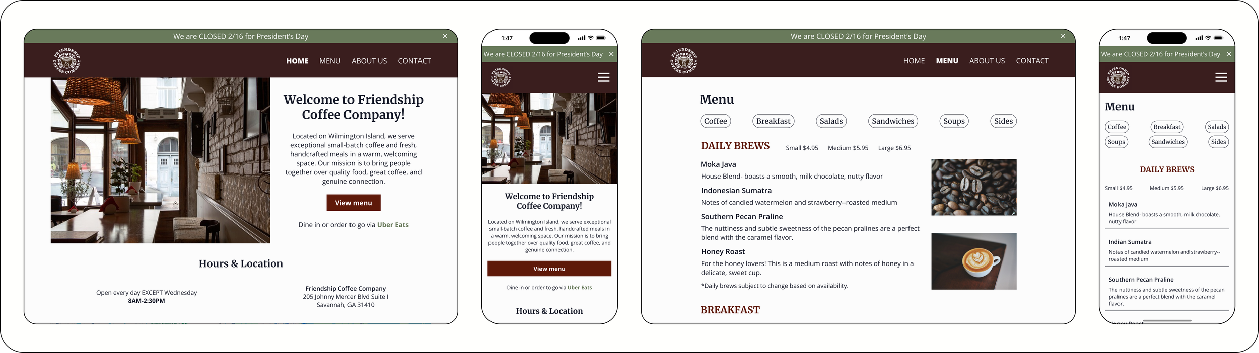
Frame 1: Home page, Desktop | Frame 2: Home page, Mobile | Frame 3: Menu, Desktop | Frame 4: Menu, Mobile
Key Features
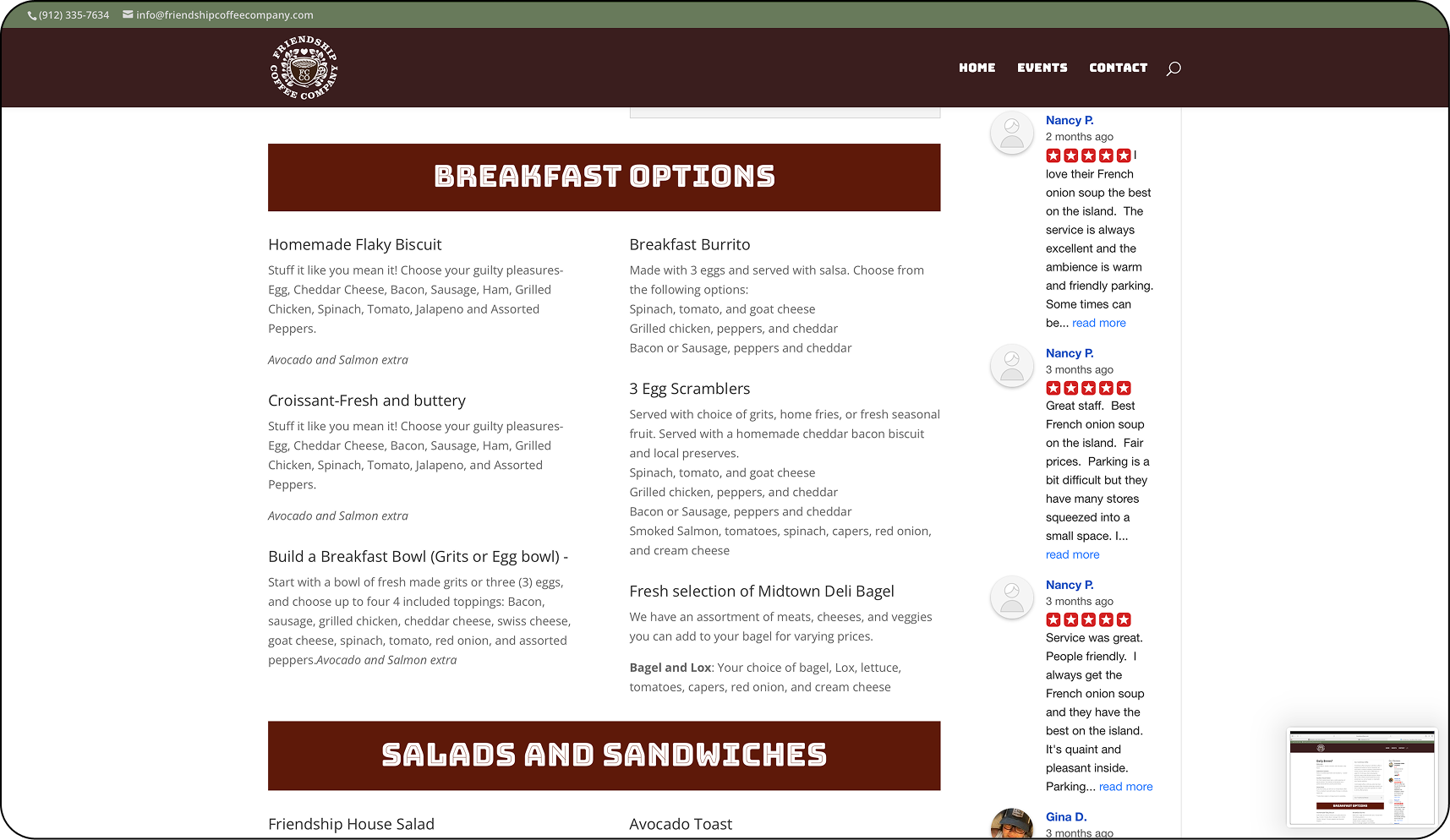
Menu Access
Users can quickly view the café’s menu and browse items organized into clear categories.
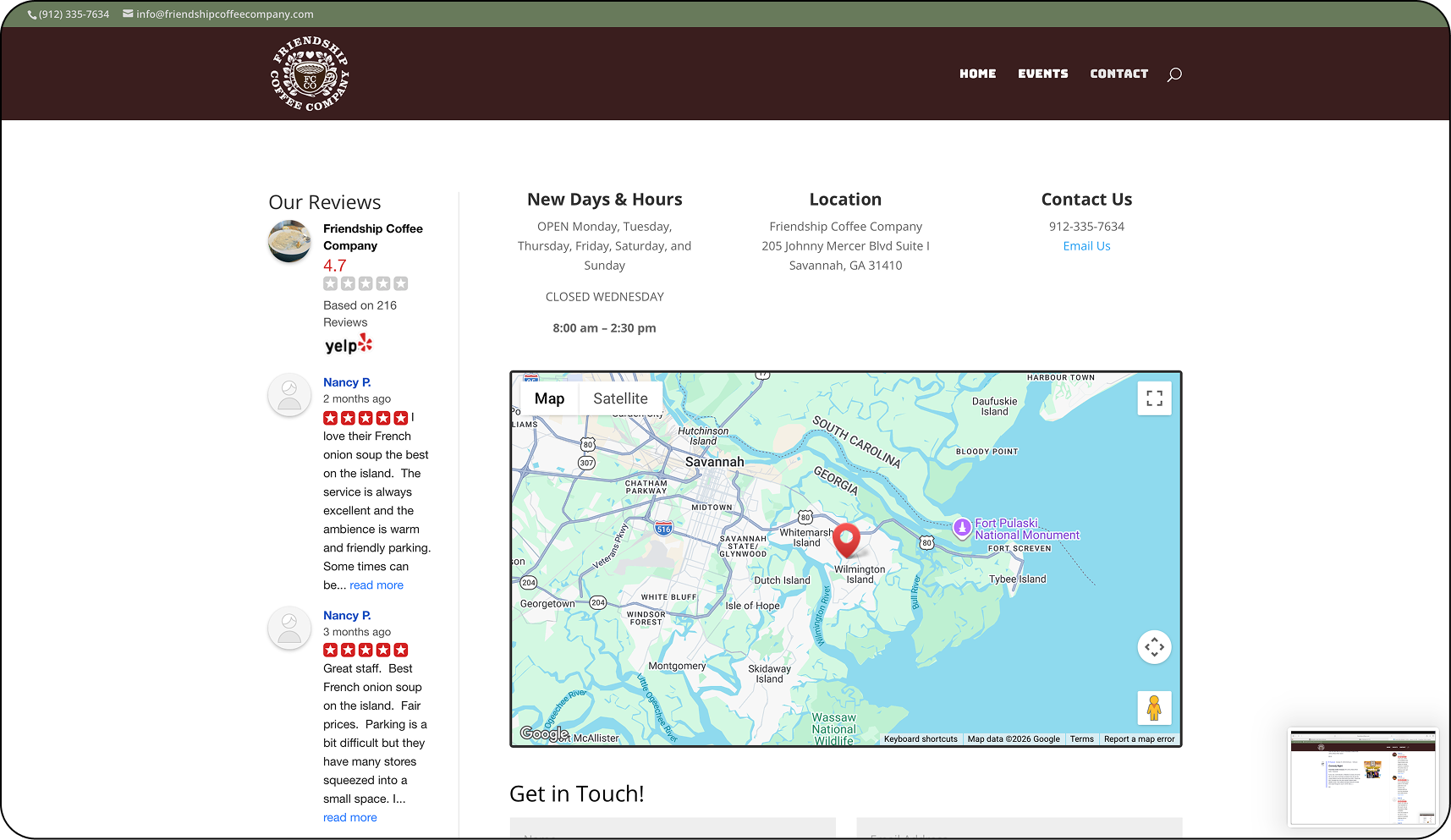
Hours & Location
Users can easily check when the café is open and view its location from the homepage.
Photo Gallery
Users can explore photos of the café, food, and drinks to better understand the atmosphere.
About the Cafe
Users can learn about FCC’s story, community focus, and what makes the café unique.
Testing
Usability Testing
Usability testing was conducted through moderated sessions using a high-fidelity prototype of the redesigned website. Participants completed key tasks, including viewing the menu, checking hours and location, and finding information about the café experience, to evaluate how easily they could navigate the site. Overall, users found the interface clear and intuitive, while their feedback helped identify opportunities to improve information placement, tap targets, and visual hierarchy.
Key Successes
Users were able to quickly locate and browse the menu, with all participants rating the task as highly intuitive and completing it with confidence.
Easy Menu Access
The overall structure of the website allowed users to easily move between pages and understand where to find key information.
Clear Navigation
Users were able to successfully find information about the café’s atmosphere and offerings, helping them understand what the visit experience would be like.
Experience Visibility
Opportunities for Improvement
Users wanted to see photos alongside menu items to better understand what the dishes look like and help them decide what to order.
Menu Experience
Some users expected to see hours and location information closer to the top of the homepage for faster access.
Hours Findability
Increasing the size of buttons and interactive elements can improve usability, particularly on mobile devices.
Tap Targets
Priority Revisions
Based on insights from usability testing, I prioritized revisions that would have the greatest impact on usability and information accessibility.
Menu Experience
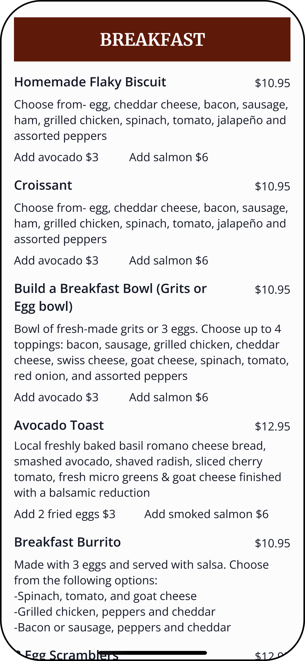
Before—Menu did not contain any photos.
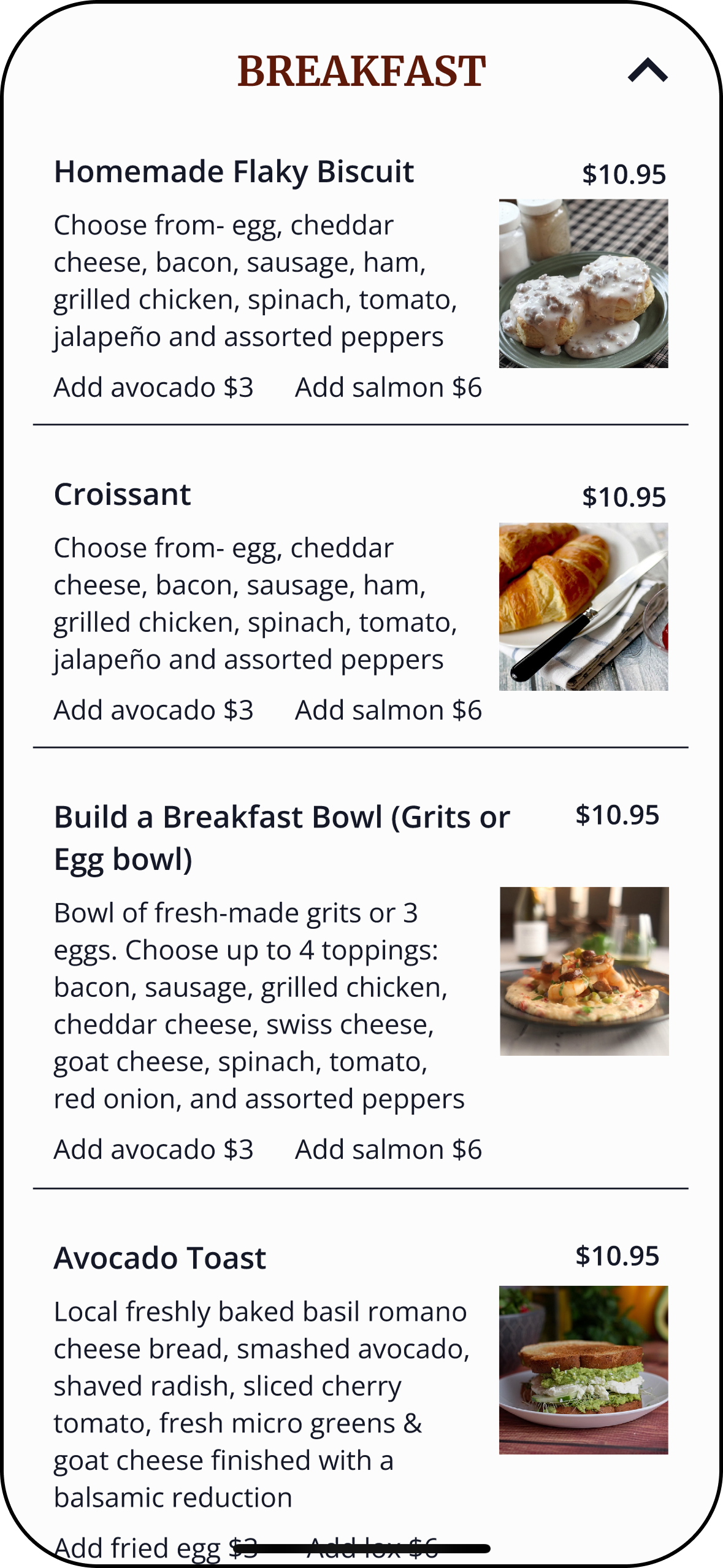
After— Added photos to every applicable menu item.
Hours Findability
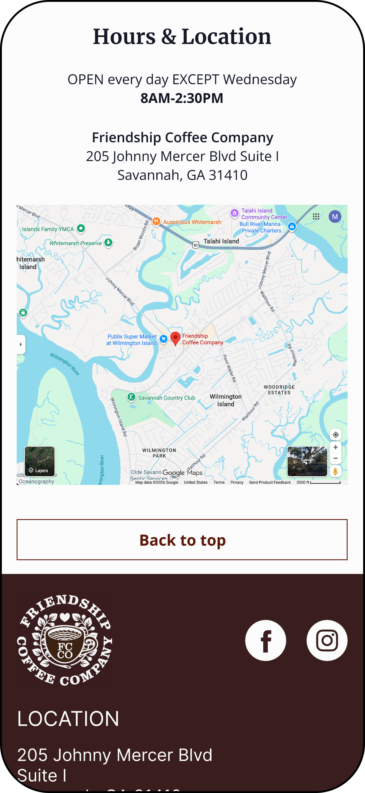
Before—Hours & Location was located at the bottom of the home page.
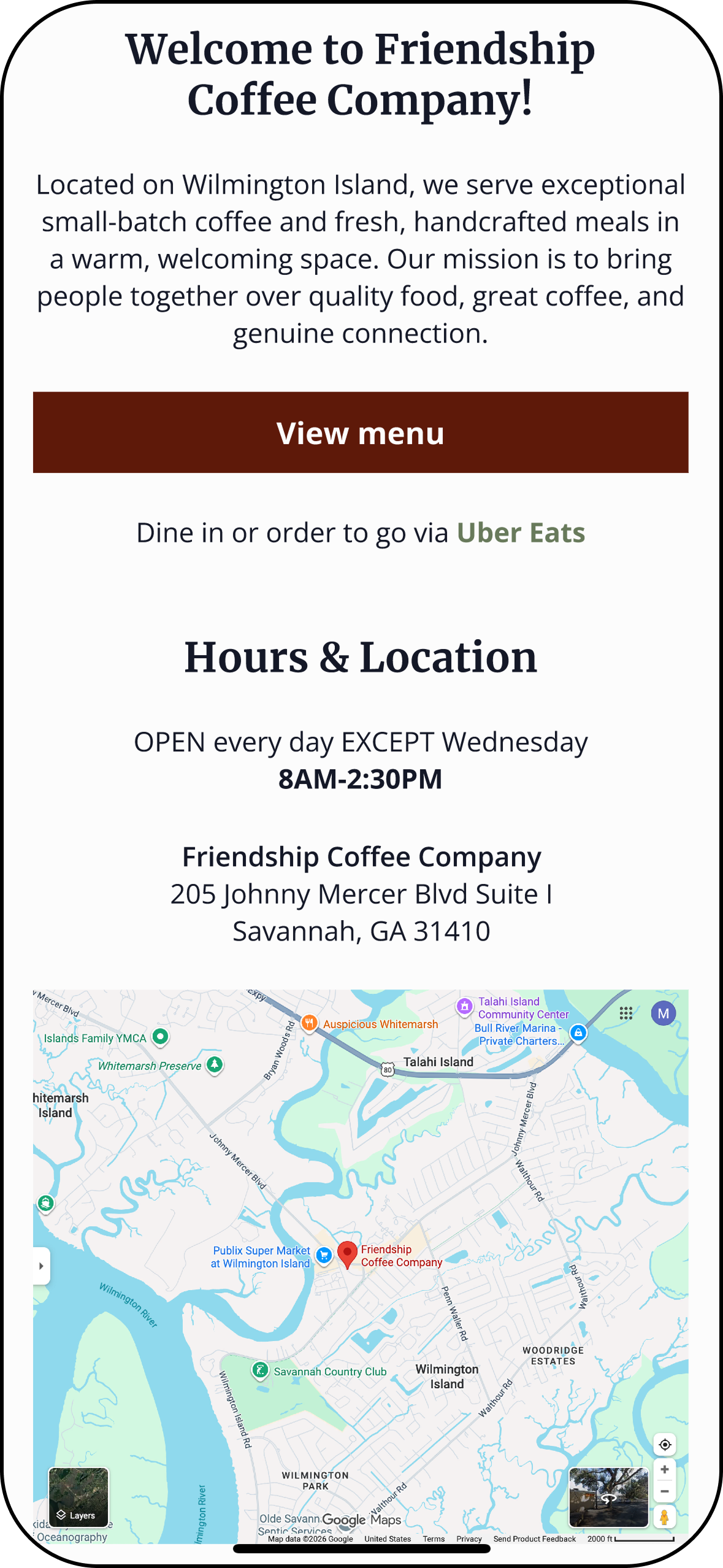
After—Moved Hours & Location to directly underneath Hero section.
Prototype
Experience Friendship Coffee Company for yourself!
Conclusion
Key Takeaways, Learnings & Next Steps
Designing for a small business website requires prioritizing the information users care about most. Research and usability testing showed that users primarily visit café websites to quickly find menus, hours, and location, while also wanting to preview the atmosphere before deciding to visit. By focusing on clear information hierarchy, mobile usability, and visual storytelling, the redesign creates a more intuitive experience that supports both user needs and business goals.
Key Takeaways
This project strengthened my ability to translate research insights into practical design decisions while working within existing brand constraints. I learned the importance of structuring information so users can quickly accomplish their goals, especially on mobile devices. Conducting usability testing also reinforced how valuable real user feedback is for identifying small but impactful improvements such as tap target size, information placement, and visual hierarchy.
What I Learned
Future iterations would focus on further refining the menu experience by enhancing image consistency—using real photos of actual menu items—while continuing to improve spacing and visual hierarchy across the site. Additional testing with a broader group of users could help uncover new opportunities to improve navigation and decision-making support. If implemented for the live business, the design could also explore features such as event promotion or online ordering integrations to further support customer engagement.
Next Steps