

LUMEN
End-to-End Application
Designed an end-to-end personal finance aggregation app that consolidates financial accounts and delivers personalized insights to help users better understand and manage their money.
Overview
Finance aggregation application
Managing personal finances often requires juggling multiple apps and accounts, making it difficult for users to see their full financial picture. This project explores Lumen, a mobile finance aggregation app designed to consolidate accounts and provide personalized, easy-to-understand insights that help users feel more confident and in control of their finances.
Duration
Role
6 weeks
Sole Designer & Researcher
Skills
Research UX/UI Branding Testing
Discovery
The Problem
Users often juggle multiple financial apps, making it difficult to see their full financial picture and stay on top of their money. Many existing tools also overwhelm users with generic data and raise concerns around trust and security.
The Goal
The goal of Lumen was to create a centralized financial experience that consolidates accounts, delivers clear and personalized insights, and builds user trust through transparency and security.
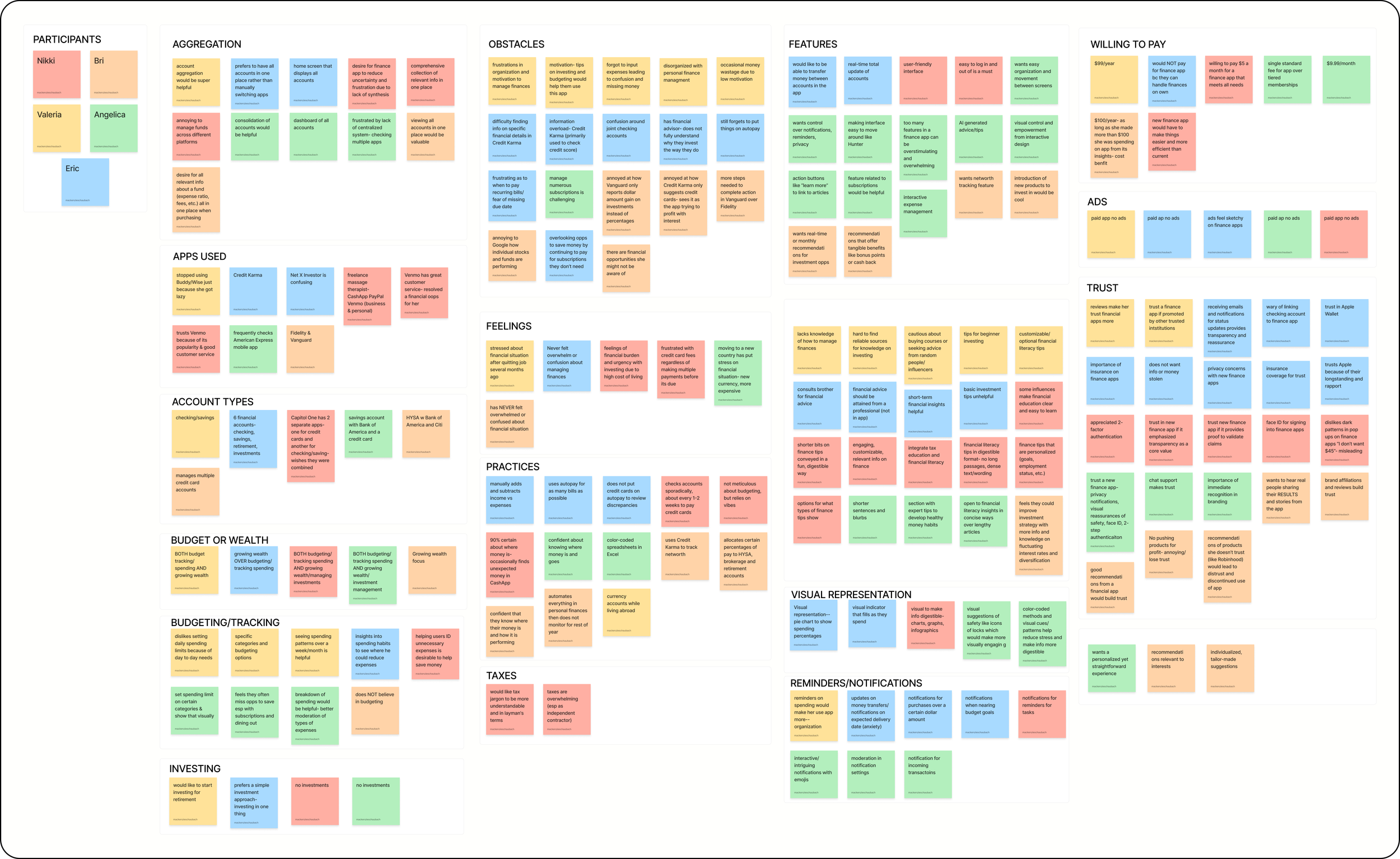
User Interviews
To better understand how people currently manage their finances, I conducted user interviews and research focused on financial habits, frustrations with existing tools, and trust concerns around financial apps.
Interviewees
Demographics
5
Ages 22-35
Method
Moderated
Key Insights
Account aggregation is a highly desired feature, allowing users to view and manage all financial accounts in one place.
Most participants demonstrated beginner to intermediate financial literacy, highlighting the need for clear and approachable financial guidance.
Trust is a major concern, with users preferring apps that clearly communicate strong security and a reputable brand presence.
Visual graphics are essential for helping users quickly understand their financial situation at a glance.
Users value tools that support both spending management and long-term wealth growth, such as budgeting and investment tracking.
Personalized financial insights and recommendations are highly desirable to help users make more informed decisions.
Competitive Analysis
To better understand the current financial management landscape, I analyzed several leading finance aggregation apps including Monarch Money and Origin. This research helped identify common features, strengths, and gaps in existing solutions, revealing opportunities to design a product that prioritizes clarity, personalization, and user trust.
Problems with Existing Solutions
Fragmented Financial Visibility
Many existing apps require users to navigate multiple sections or tools to understand their financial health, making it difficult to quickly see a complete financial picture.
Limited Investment and Planning Tools
Some competitors focus heavily on budgeting or spending tracking but provide limited support for investment insights, long-term financial planning, or wealth growth features.
Affinity Mapping
To synthesize research findings, I created an affinity map to organize patterns and themes that emerged from user interviews. Grouping feedback into categories helped identify insights, common pain points, motivations, and user needs, which ultimately informed the key features and design priorities for the app.
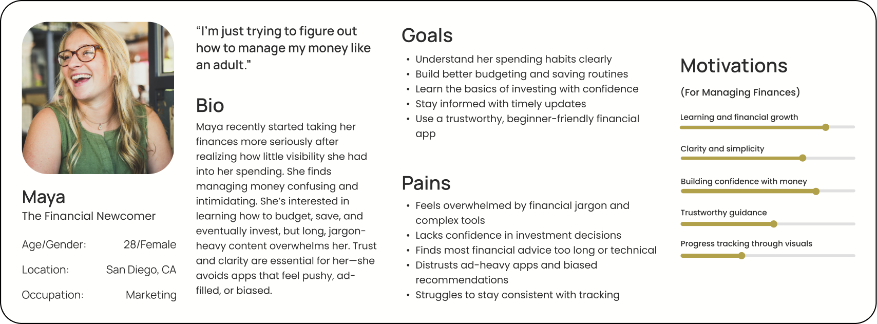
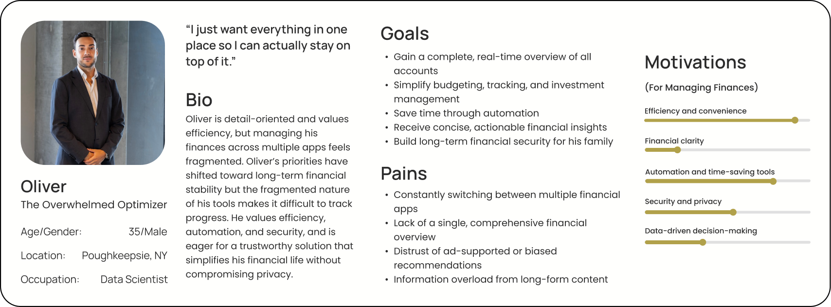
Understanding the User
Based on research insights, two personas were developed to represent the primary user groups for this product: Oliver, the Overwhelmed Optimizer, and Maya, the Financial Newcomer. While Oliver represents users who actively manage multiple financial accounts and seek efficiency and automation, Maya represents individuals who are newer to personal finance and need clarity, guidance, and confidence-building tools.
User Needs and Wants
Centralized view
Understanding finances as a whole with all accounts in a central place.
Personalization
Receive insights based on user’s specific financial needs instead of generic finance tips.
Insights
Learn how to manage finances through quick, digestible insights.
Trust
Users want a trustworthy tool with strong security and transparency.
Ideation
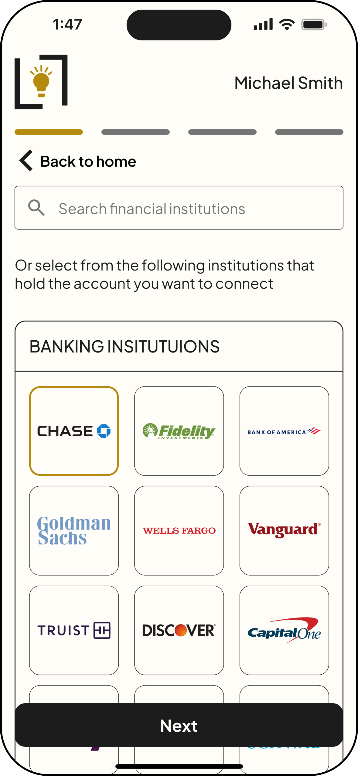
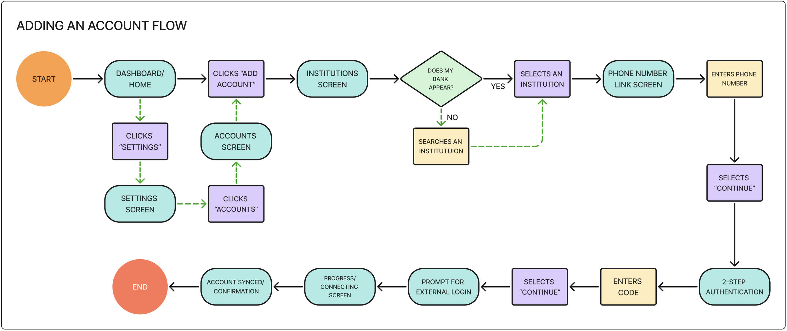
User Flow
This user flow illustrates how users connect a financial account to the Lumen app. From the dashboard, users select “connect account,” search for their financial institution, and securely authenticate their credentials. Once verified, the account is added to the dashboard, allowing balances and transactions to be automatically aggregated in one place.
Mid-Fidelity Screens
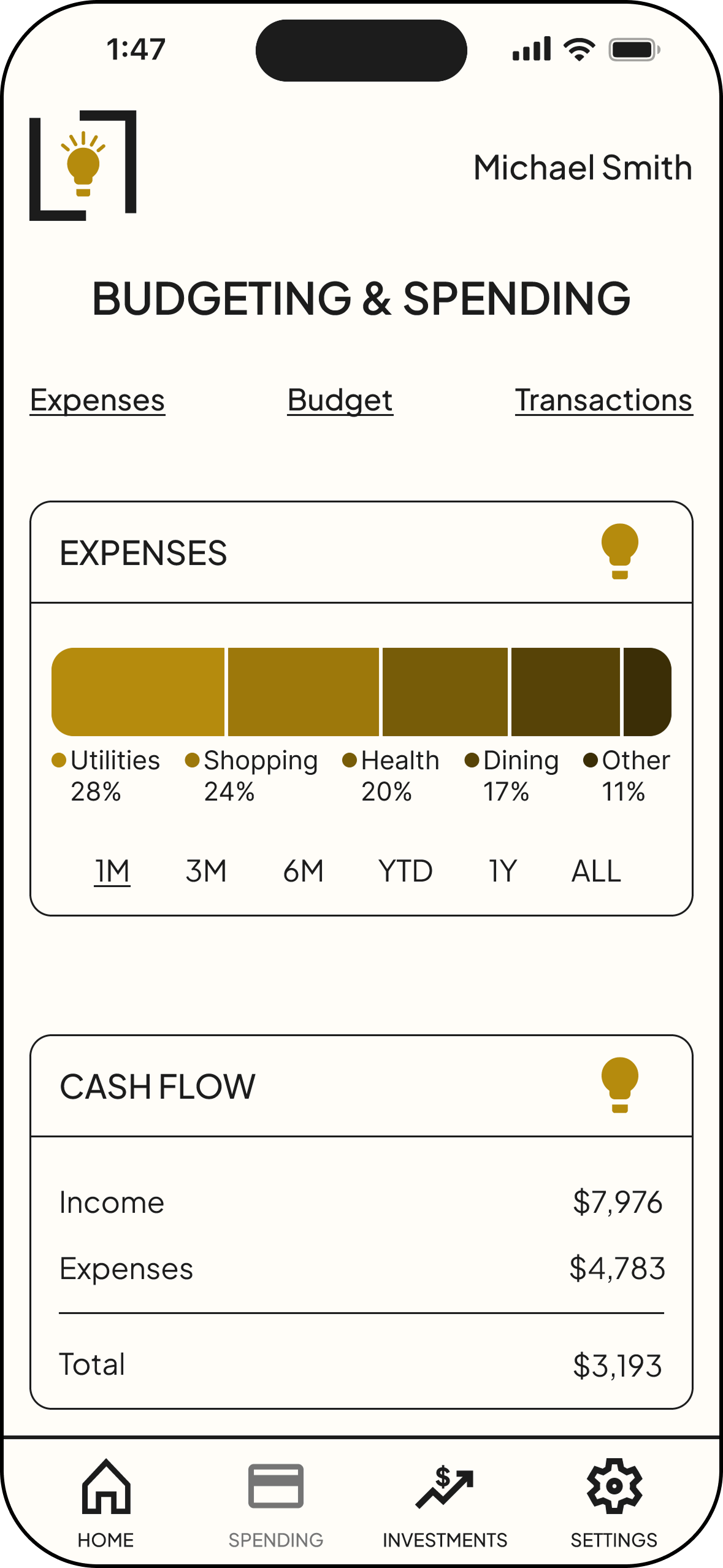
After ideating through low-fidelity sketches, mid-fidelity screens were created to refine layout, navigation, and information hierarchy of the app before moving on to visual design. At this stage, I focused on ensuring that key features—such as onboarding, account connection, and the dashboard—were intuitive and easy to navigate. These screens allowed me to test the overall structure and user flows while identifying opportunities to simplify interactions and improve clarity.
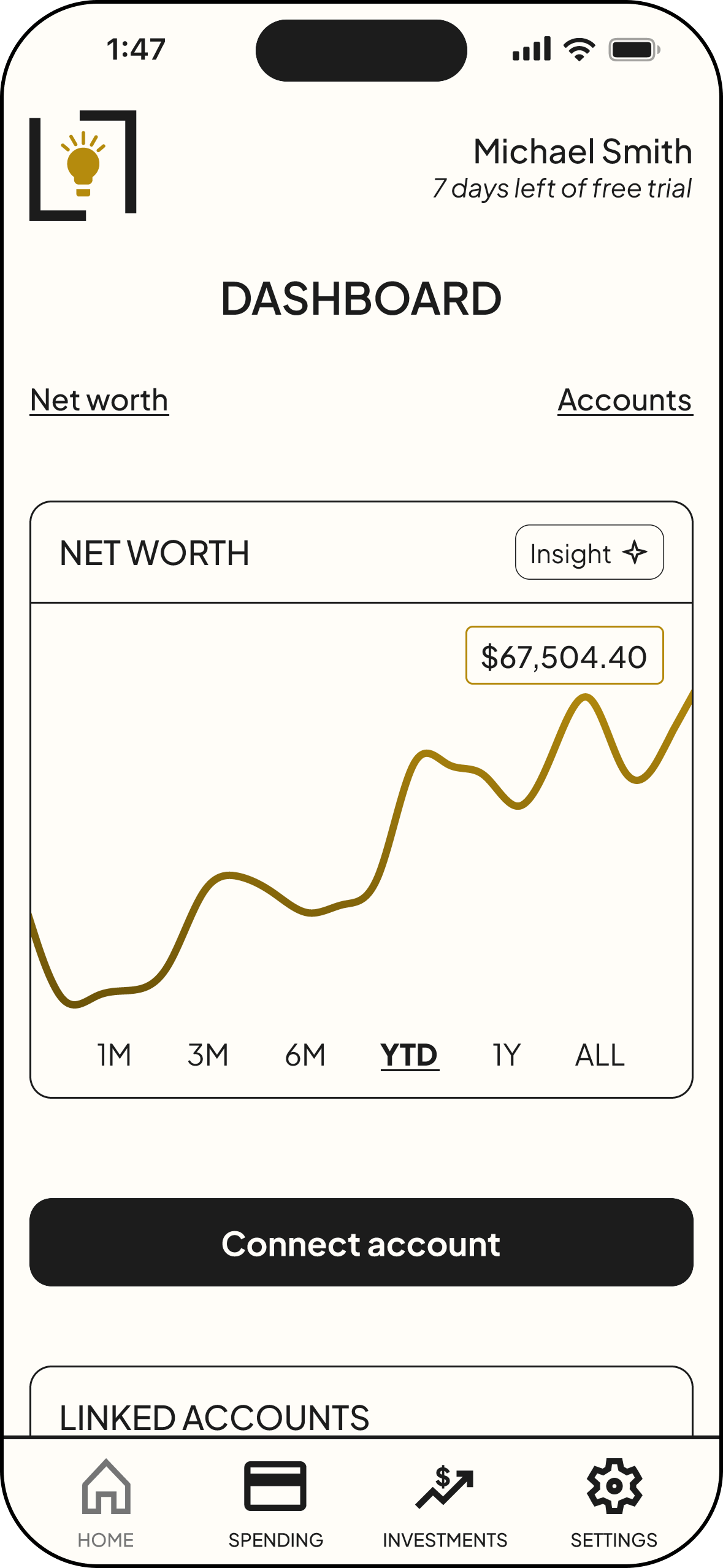
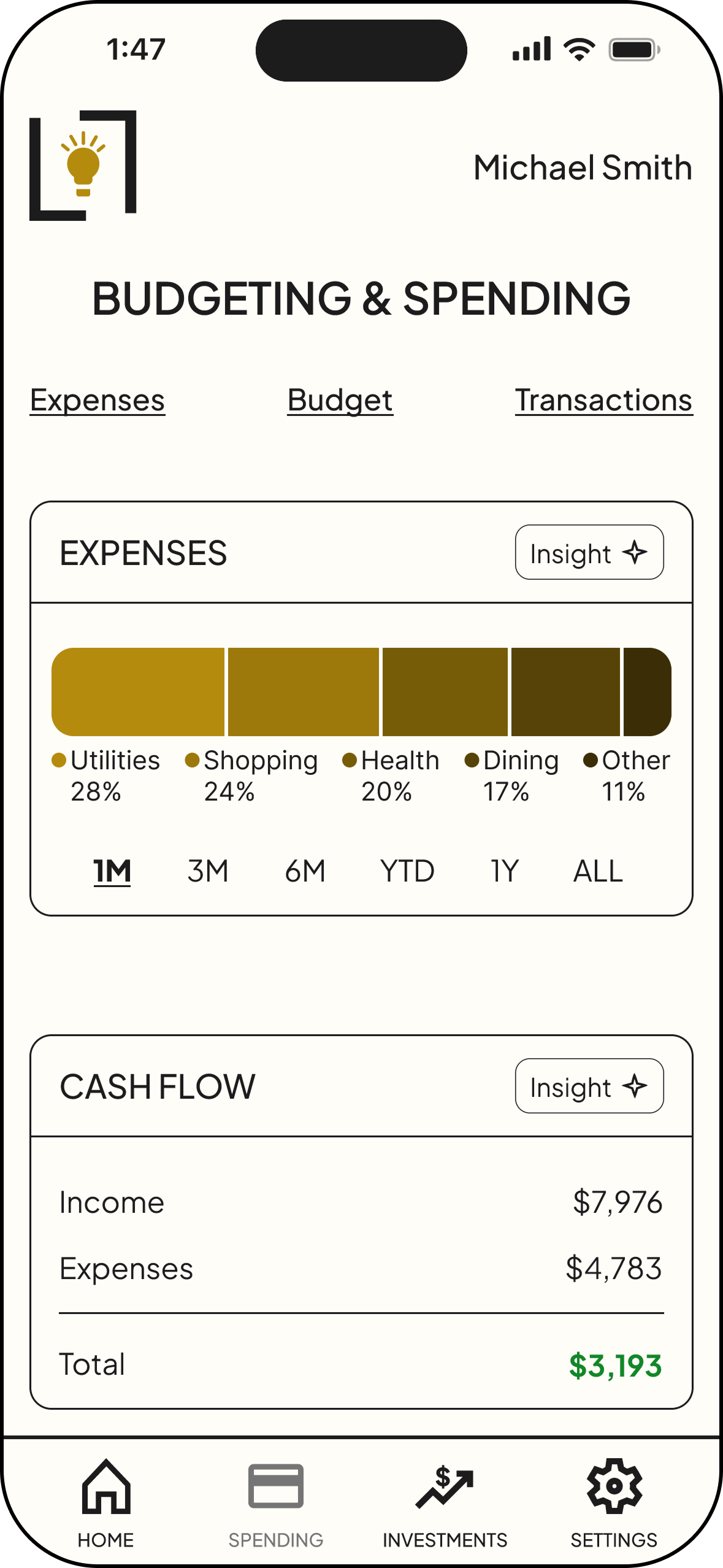
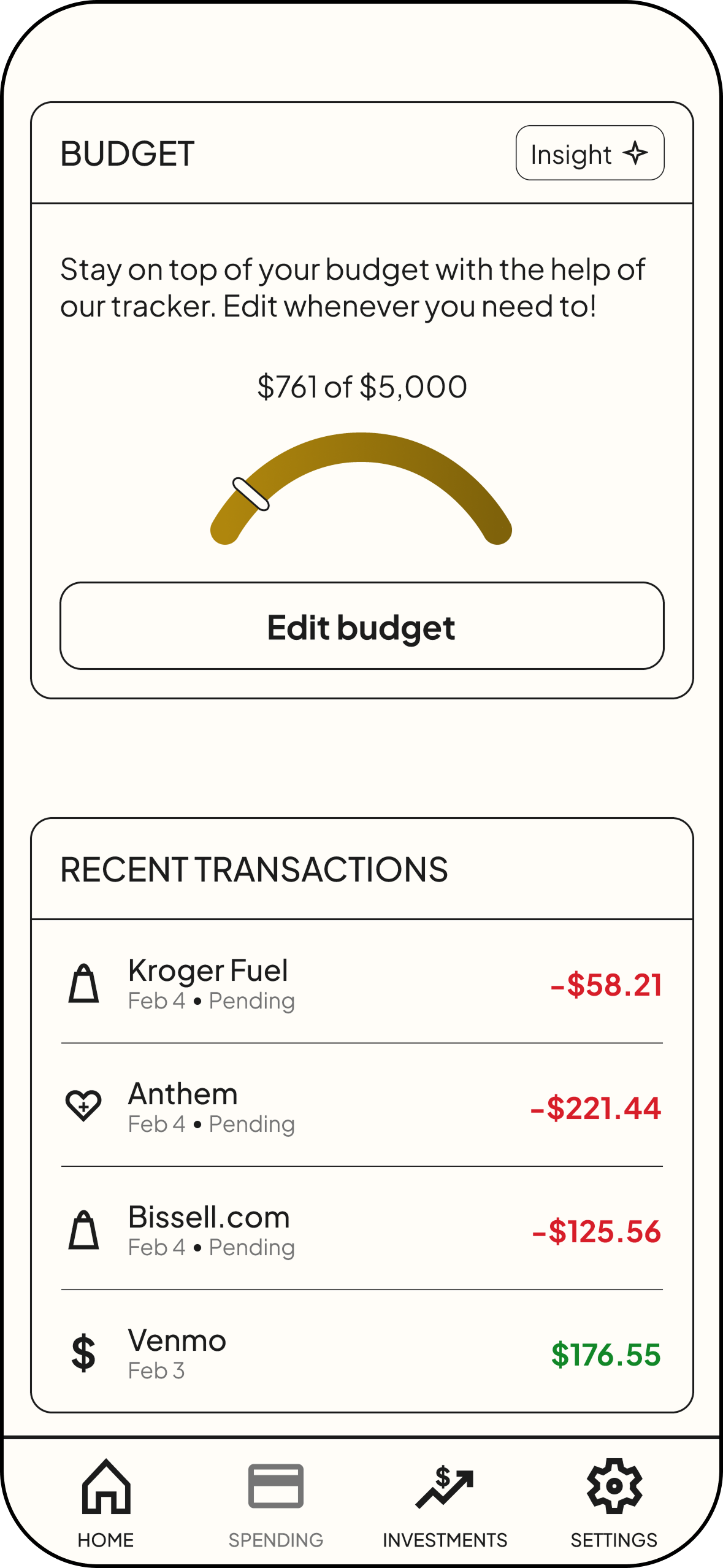
Frame 1: Insights quiz | Frame 2: Dashboard | Frame 3: Connected accounts list on Dashboard | Frame 4: Budgeting & Spending screen | Frame 5: Insights modal | Frame 6: Settings
Design
Branding
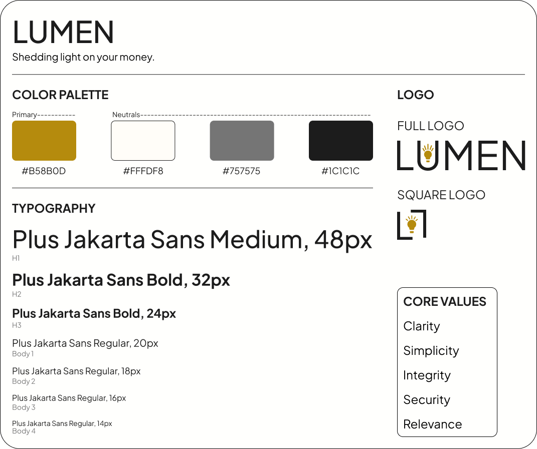
For the visual identity, I aimed for a modern, polished look that communicates clarity, trust, and simplicity in financial management. The warm gold accent paired with neutral tones reinforces the brand’s focus on illuminating financial insights, while the lightbulb logo symbolizes the idea of “shedding light” on users’ money. I chose Plus Jakarta Sans for its clean, modern readability, ensuring the interface feels approachable and easy to navigate while supporting Lumen’s goal of making financial information clear and accessible.
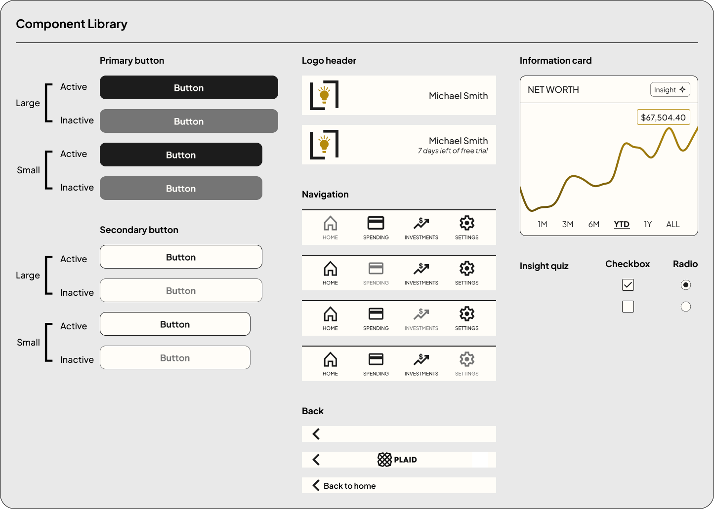
UI Kit
A UI kit was developed to ensure consistency and scalability across the Lumen interface. Core components such as buttons, navigation menus, headers, form inputs, and insight selection elements were standardized to create a clear and intuitive user experience. These elements were designed to reinforce the app’s focus on simplicity and clarity while making it easy to maintain consistency as the product grows.
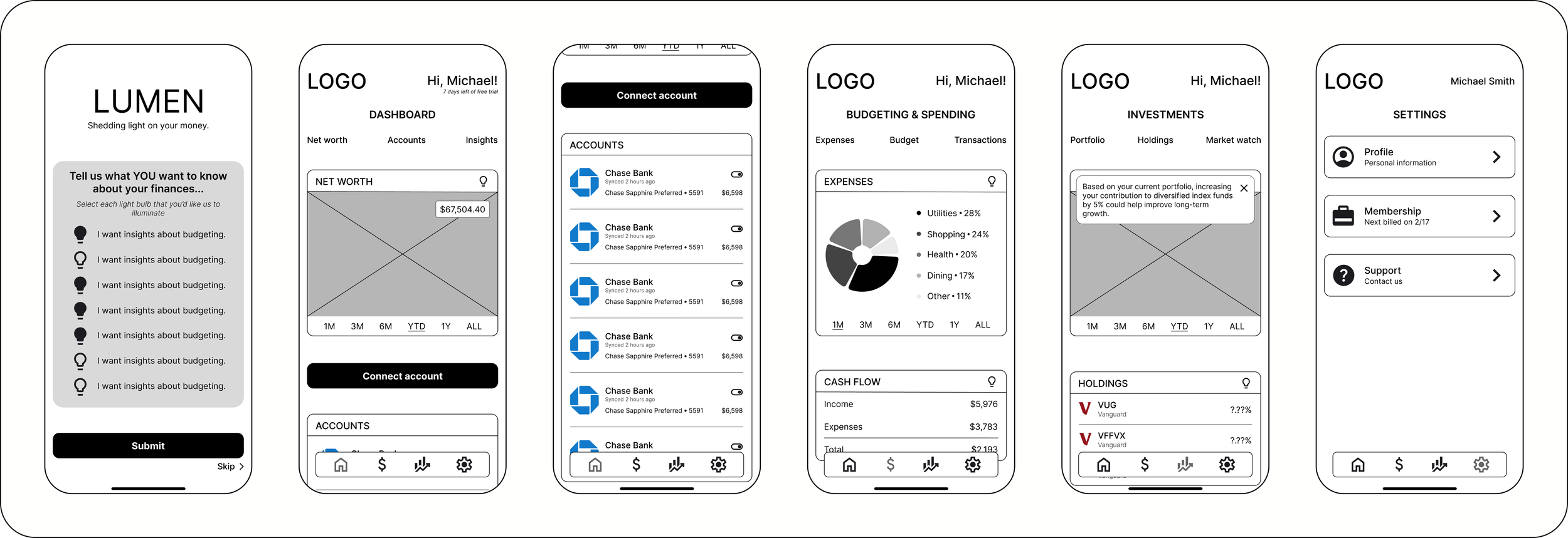
High Fidelity Screens
Applying style tile and UI kit, I developed high-fidelity screens to translate the visual system into the full product experience. This phase focused on applying the brand colors, typography, and components across core features while refining layout, spacing, and hierarchy to ensure the interface felt clear and cohesive. The high-fidelity designs helped simulate the final product and ensured financial information was presented in a way that felt intuitive, trustworthy, and easy to understand.
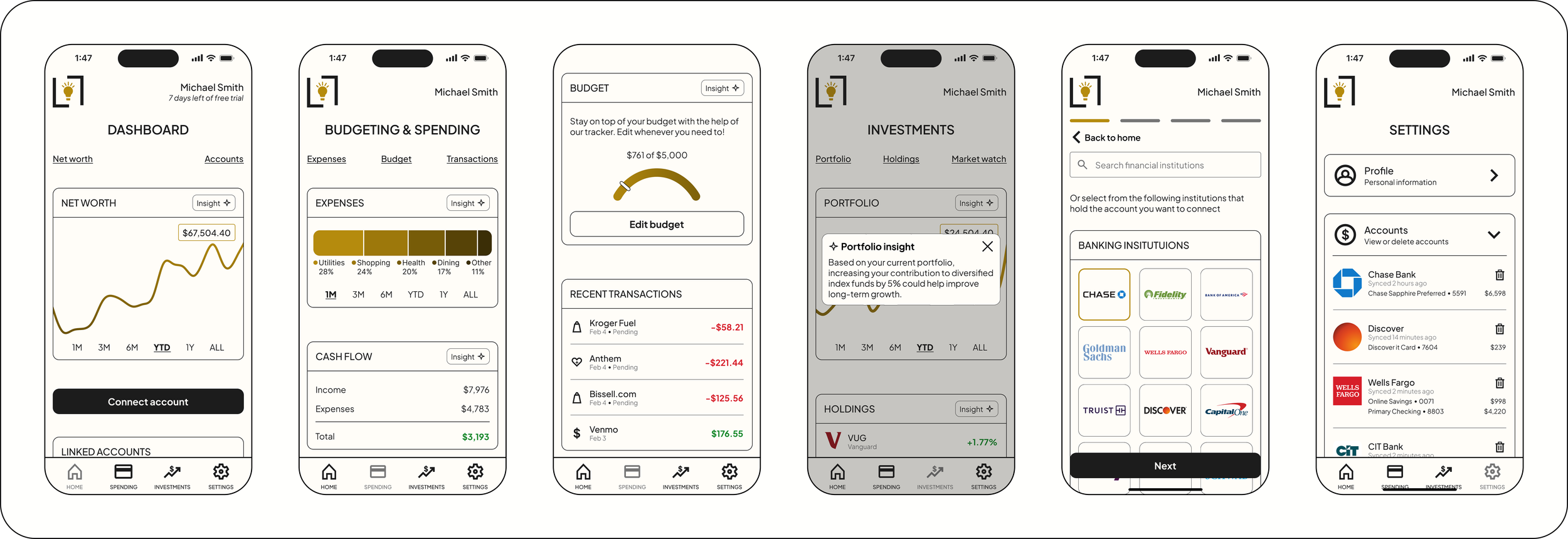
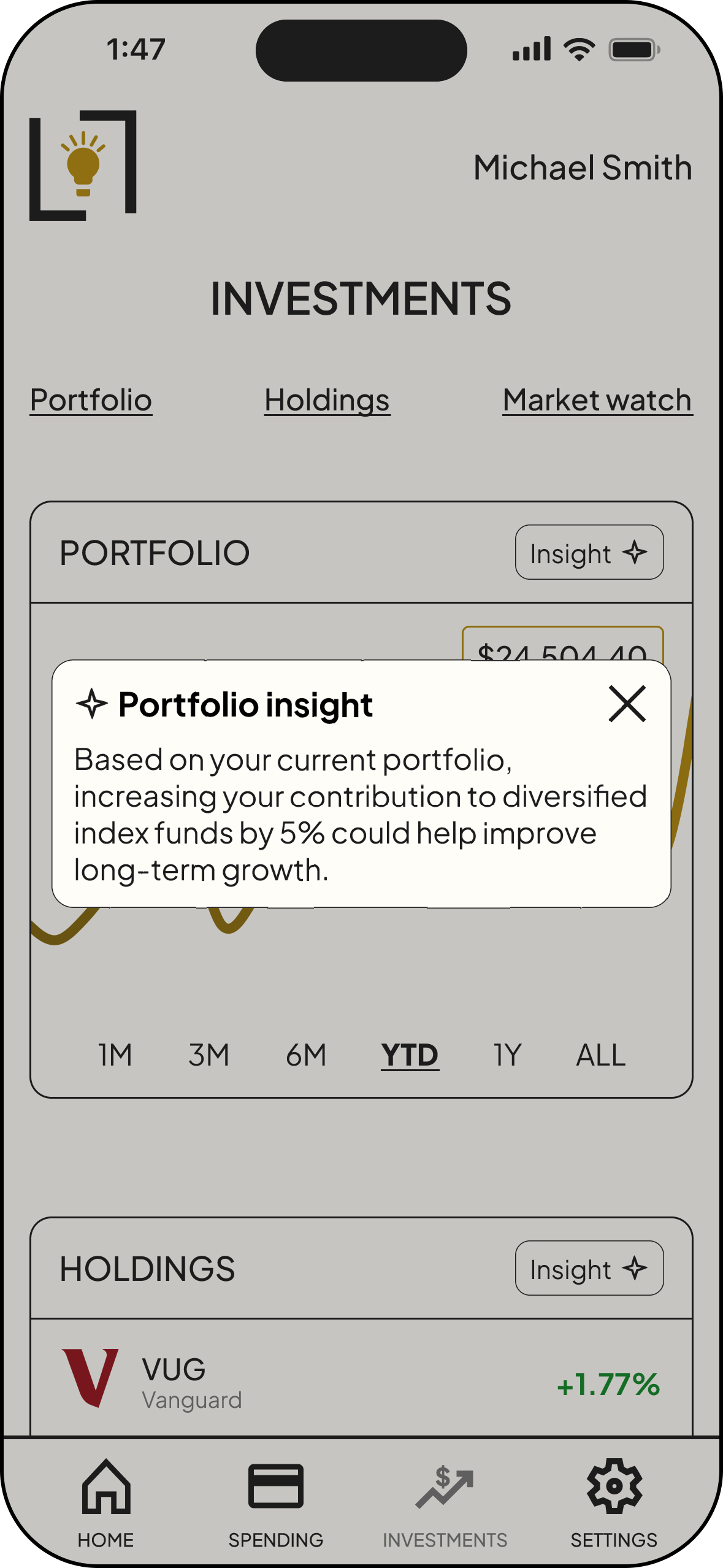
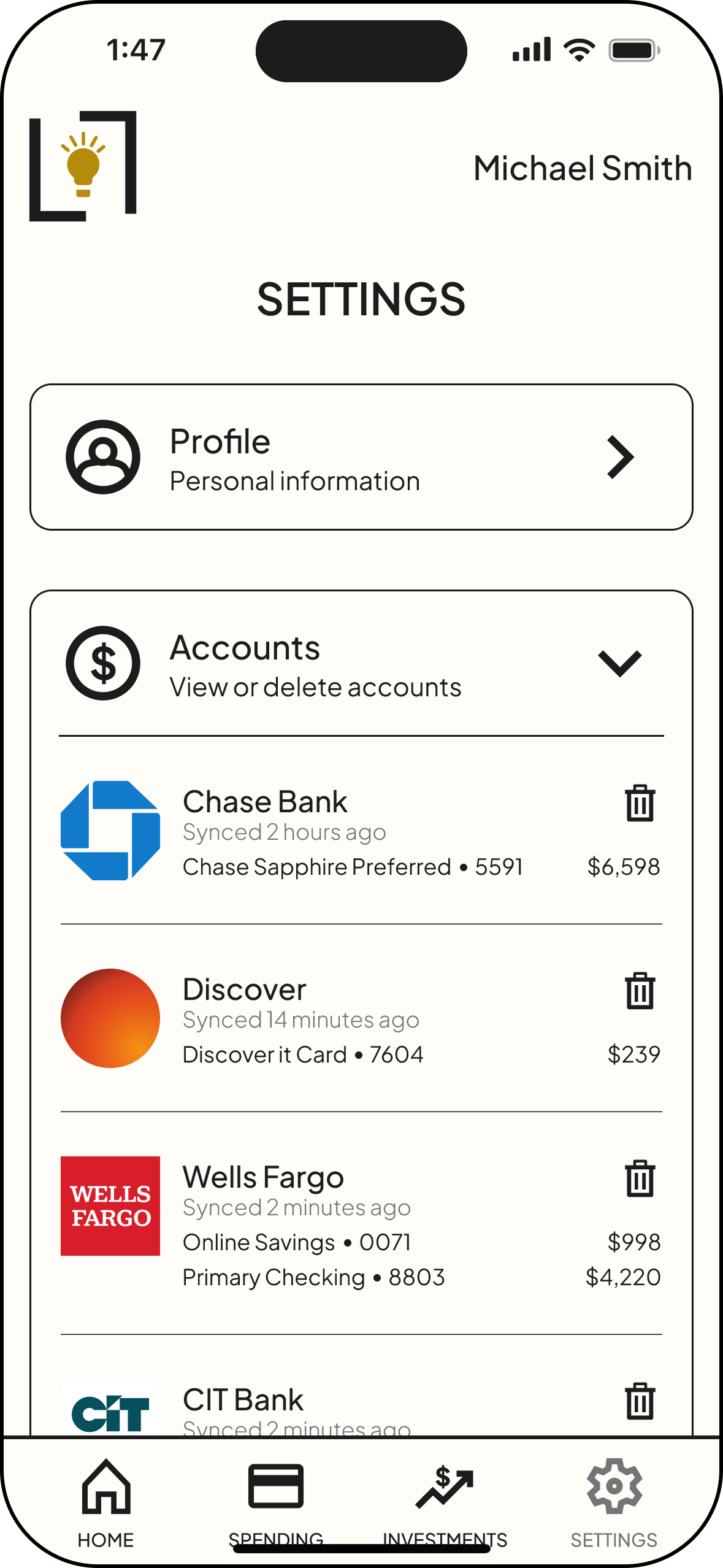
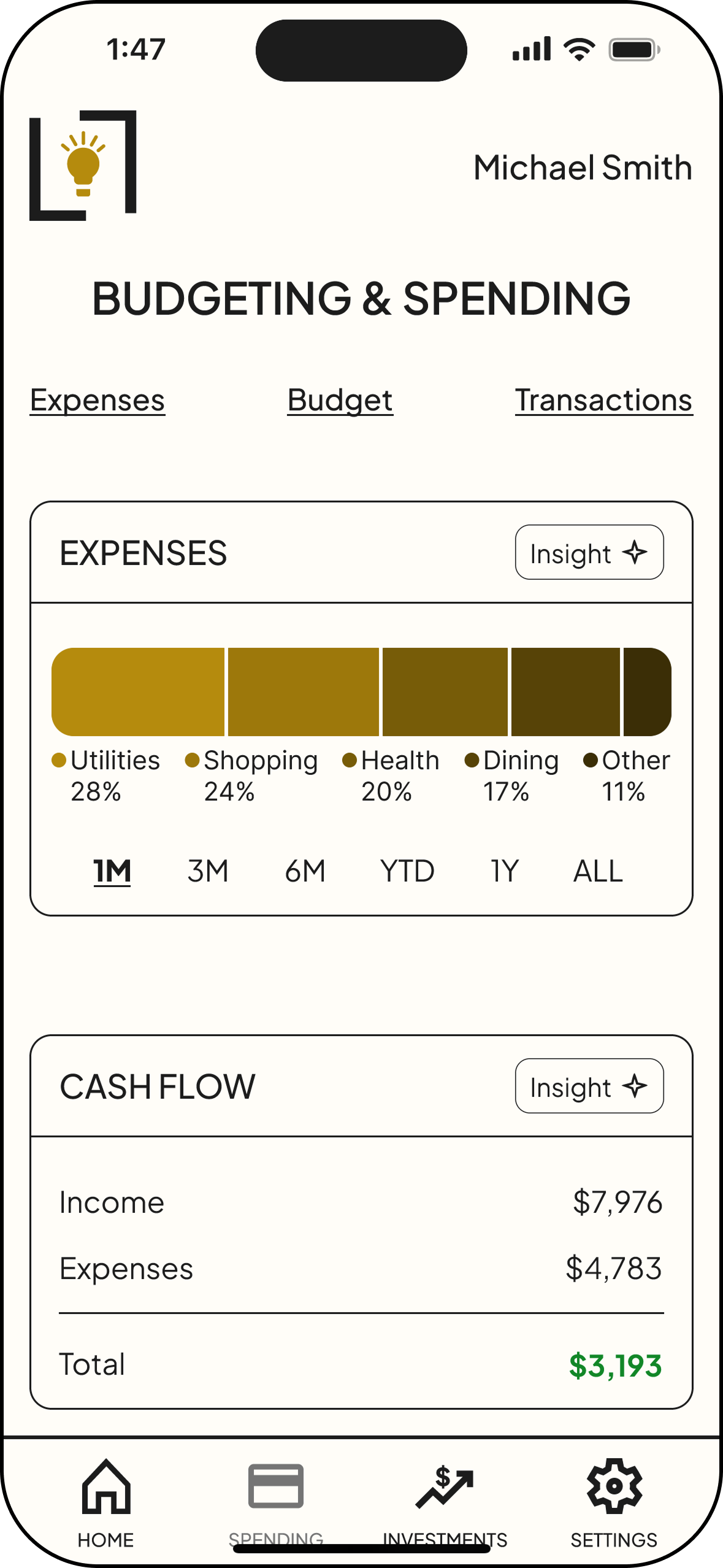
Frame 1: Dashboard | Frame 2: Budgeting & Spending screen | Frame 3: Budget & Transactions | Frame 4: Portfolio insight | Frame 5: Connecting accounts | Frame 6: Accounts in Settings
Key Features
Aggregation
Users have the ability to see a comprehensive list of financial accounts in one place.
Insights
Users can view personalized AI-powered insights about specific areas of their finances.
Users can quickly visualize their spending habits, net worth, and budget with relevant graphics.
Visuals
Users feel that their data is safe with 2-factor authentication, encryption, and FDIC insurance.
Security
Testing
Usability Testing
Usability testing was conducted through moderated sessions using a high-fidelity prototype of the app. Participants completed several key tasks, including onboarding, selecting insight preferences, and connecting financial accounts, to evaluate how easily they could navigate the experience. Overall, users found the interface clear and intuitive, and their feedback provided helpful insights for improving security cues and account management interactions.
Key Successes
Participants were able to complete all core tasks and consistently described the interface as clear, intuitive, and easy to navigate.
Intuitive Navigation
Users responded positively to selecting their preferred financial insights during onboarding, which helped the experience feel tailored to their needs.
Personalized Onboarding
Participants quickly understood the app’s layout and were able to locate key sections without confusion.
Logical Structure
Opportunities for Improvement
Participants wanted stronger visual and messaging cues that their financial data was secure when connecting accounts.
Security Reassurance
Participants wanted clearer options and confirmation steps for managing connected accounts, along with easier access to these controls within the settings.
Account Management Clarity
Some participants had difficulty identifying where insights were located and suggested clearer visual cues for improved findability.
Insights Findability
Priority Revisions
Based on insights from usability testing, I prioritized revisions that would have the greatest impact on usability and task clarity. These updates focused on refining key interactions and improving the overall intuitiveness and experience.
Account Management Clarity
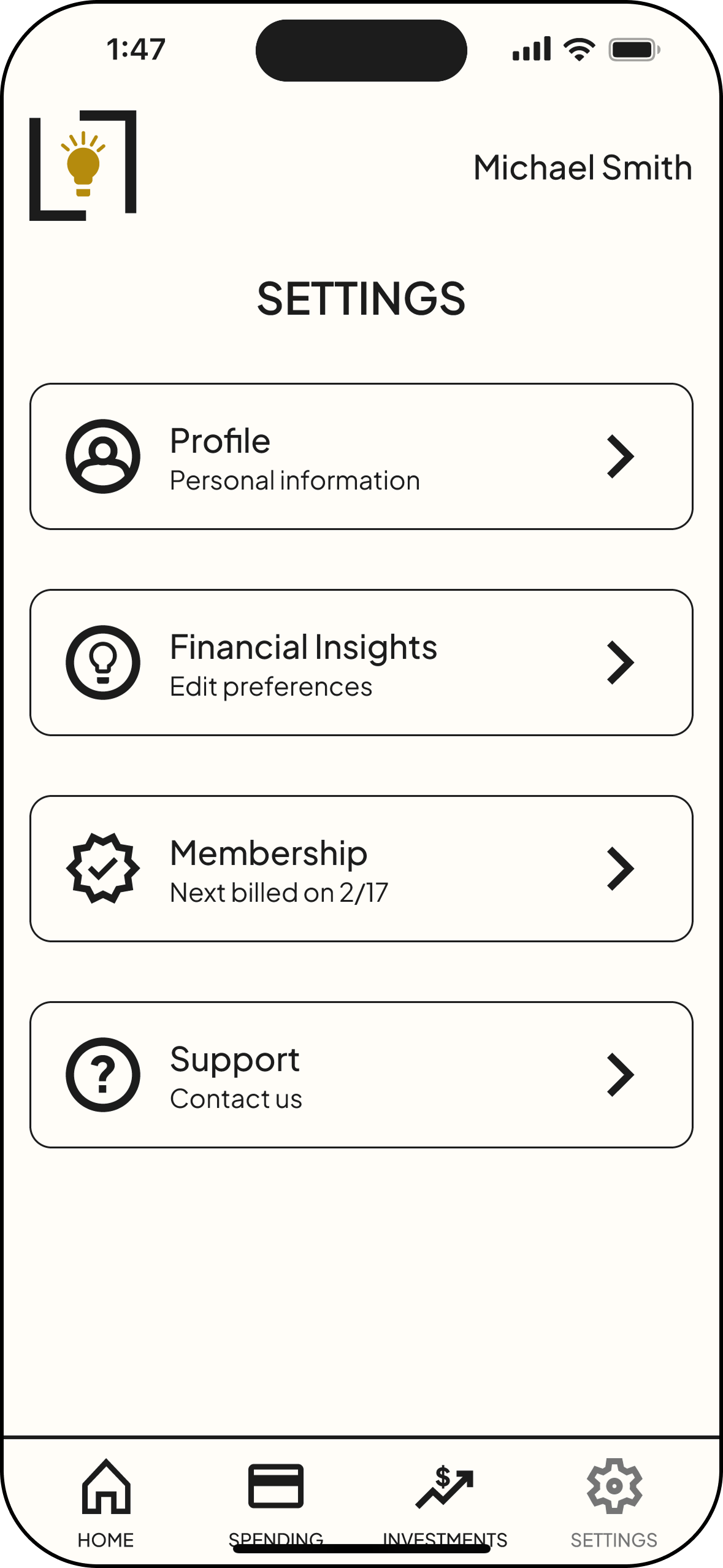
Before—Users expected to be able to manage accounts from the Settings tab instead of only on Dashboard.

After— Added an Accounts section to Settings.
Insights Findability
Before—Users overlooked the light bulb icon or did not understand it was clickable.
After—Created a button to show clickability and changed icon to star to better represent insights.
Prototype
View the Lumen App in real time!
Conclusion
Key Takeaways, Learnings & Next Steps
Usability testing highlighted how strongly clarity and visibility influence user trust in financial tools. Small friction points—such as difficulty locating insights or uncertainty around account management actions—created hesitation in otherwise straightforward tasks. Prioritizing clearer navigation, stronger feedback patterns, and improved feature visibility significantly strengthened the overall usability of the experience.
Key Takeaways
This project reinforced the value of validating design decisions through real user behavior rather than assumptions. Observing where users paused, searched, or second-guessed actions revealed important gaps between design intent and user expectations. Translating those insights into focused revisions strengthened my ability to make strategic design decisions that directly improve usability.
What I Learned
Future iterations would expand functionality while continuing to strengthen user control and transparency. I would introduce a joint account feature so users can manage finances with a partner and add customizable dashboard widgetsto prioritize the information most relevant to them.
Additional improvements would include a bill calendar highlighting upcoming payments, a savings section showing how much users have saved with Lumen, and categorical budgeting tools to help users manage spending. To further build trust, I would also provide clearer information about Plaid, the third-party service used to securely connect financial accounts.
Next Steps